
• Visualize over 40 energy metrics through responsive, interactive components
• Create a dynamic infographic to highlight key capacity and demand indicators
• Ensure accessibility, mobile usability, and API integration
• 13.5K views in 2024, supporting daily decision-making during critical periods
• Praised as “spectacular,” “fantastic,” and “very useful” by ISO New England, FERC, and other energy professionals
• Demonstrated the power of strategic UX, fast iteration, and hands-on design leadership under pressure


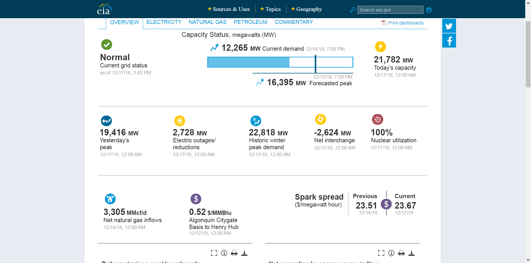
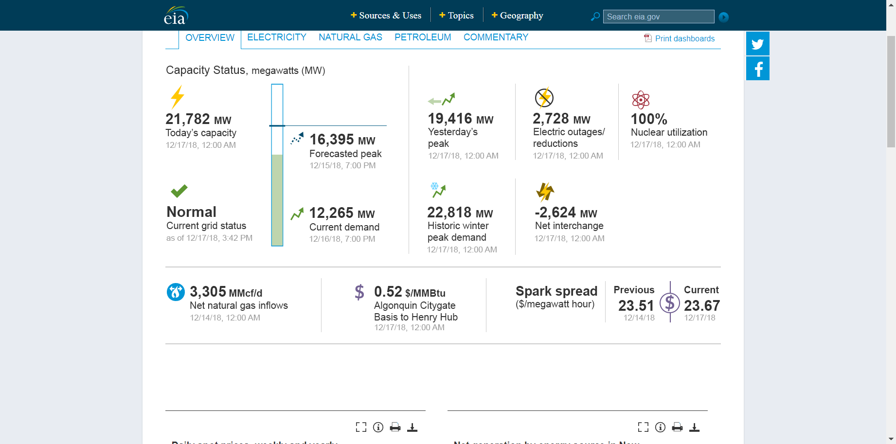

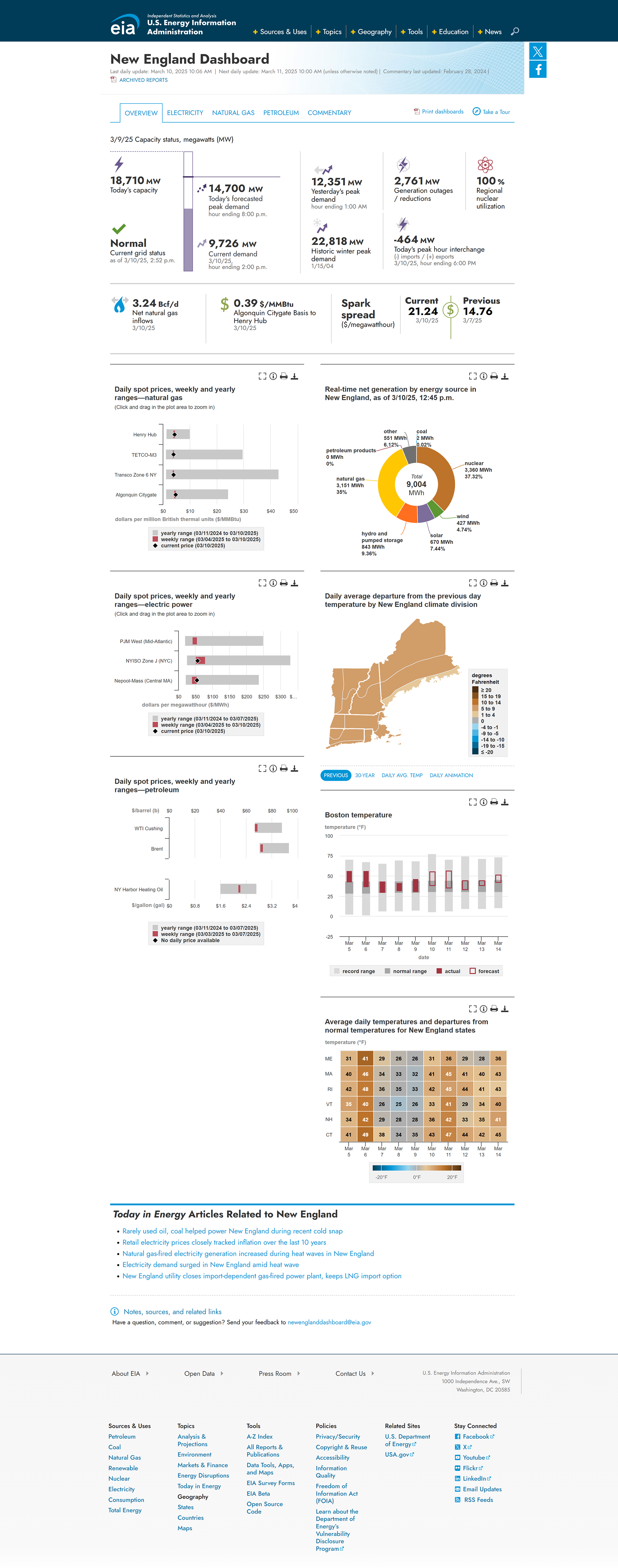
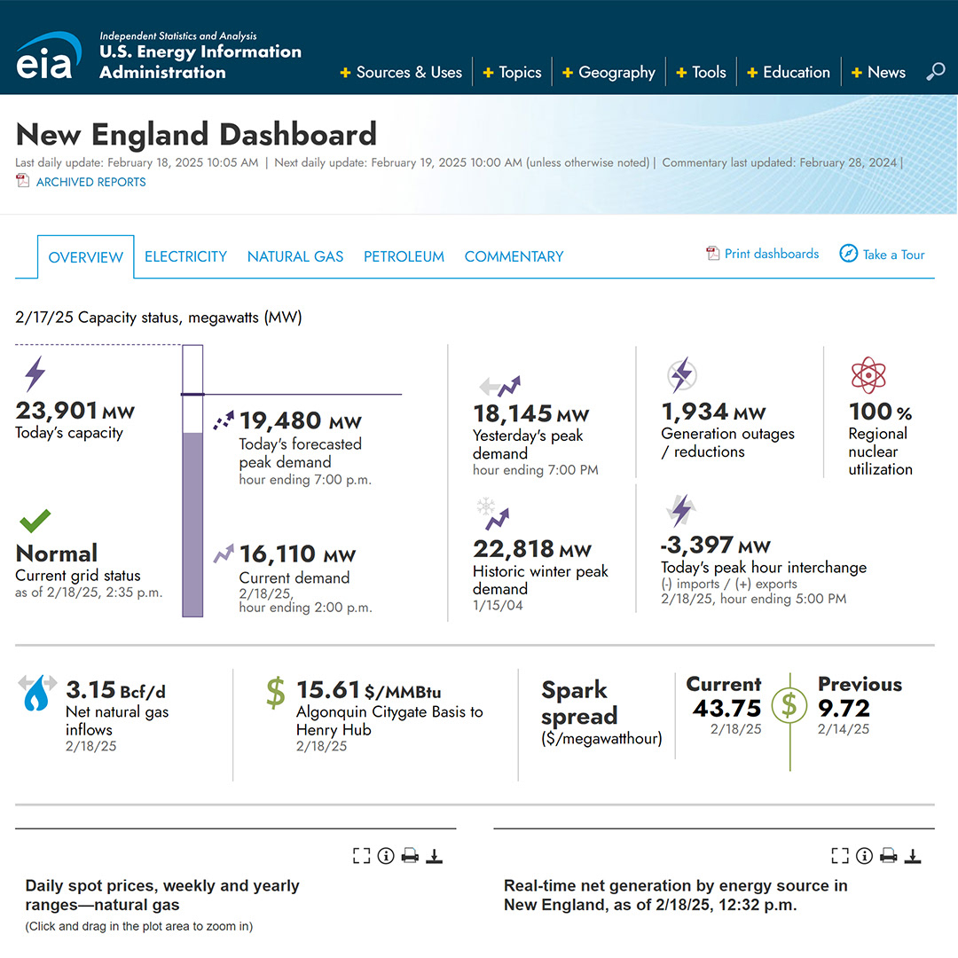
The overview page, featuring a custom, dynamic infographic at the top that shows key metrics. Users can view sources, notes, and a description; view each chart in full screen (along with the sources/notes/description); download the chart as an image and/or download the data for the chart; and print an individual chart. Every data update also generates a PDF which serves as a print-optimized view and an archive of the page and is accessible through a link in the page header.
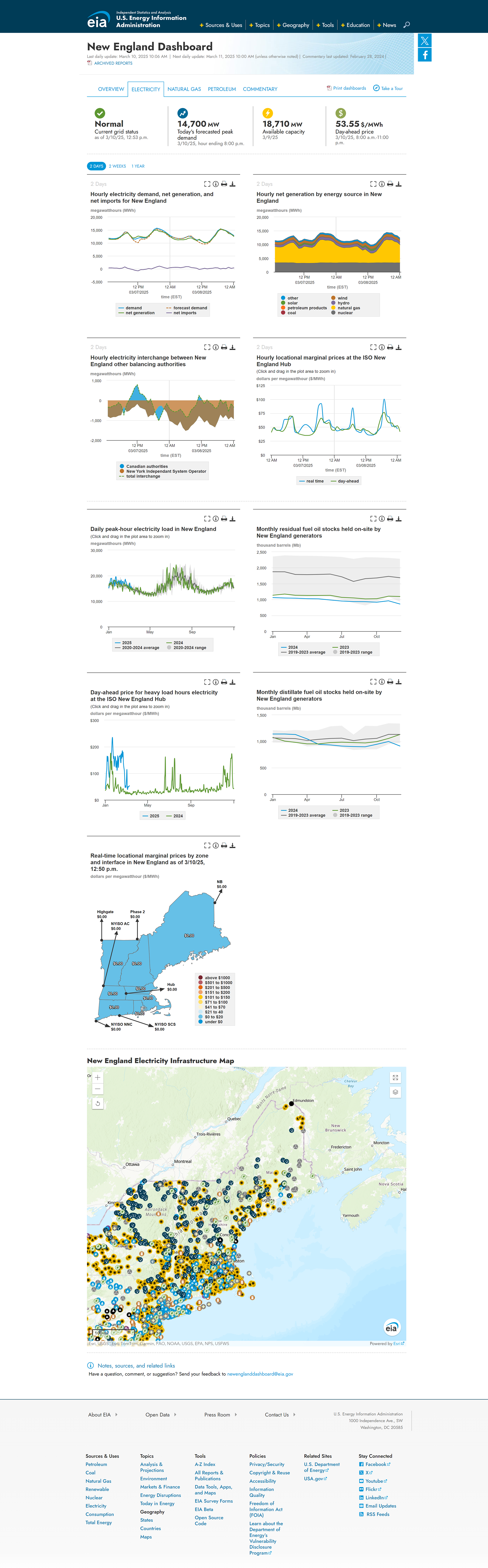
The electricity view, including key metrics at the top and an embedded ArcGIS map showing electricity infrastructure.
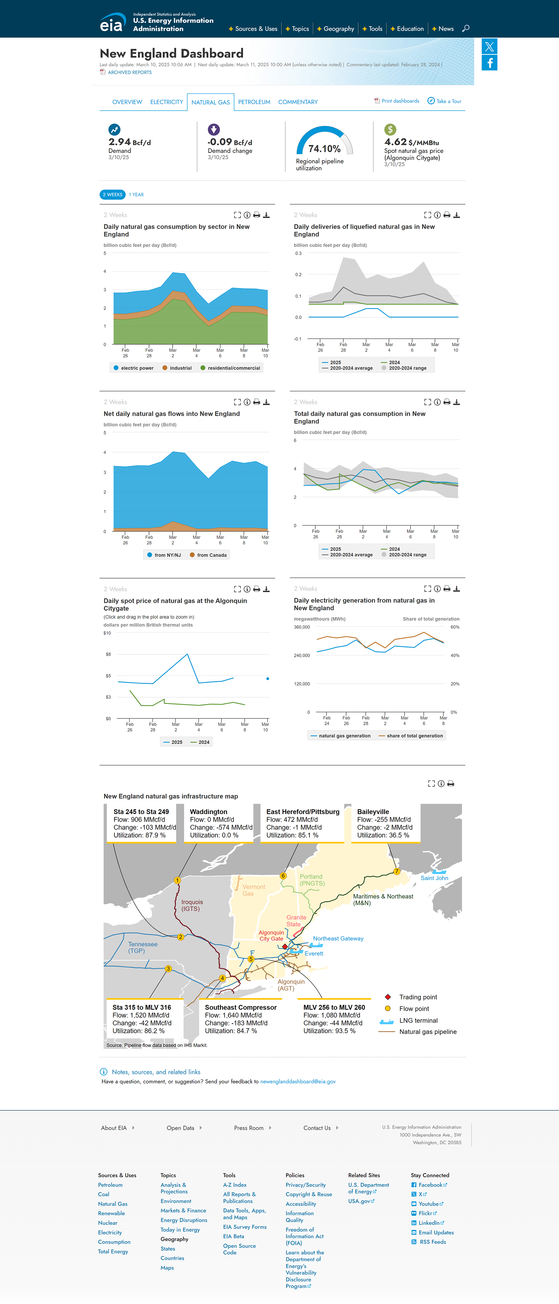
The natural gas view, including key metrics at the top and a static map with dynamic labels.
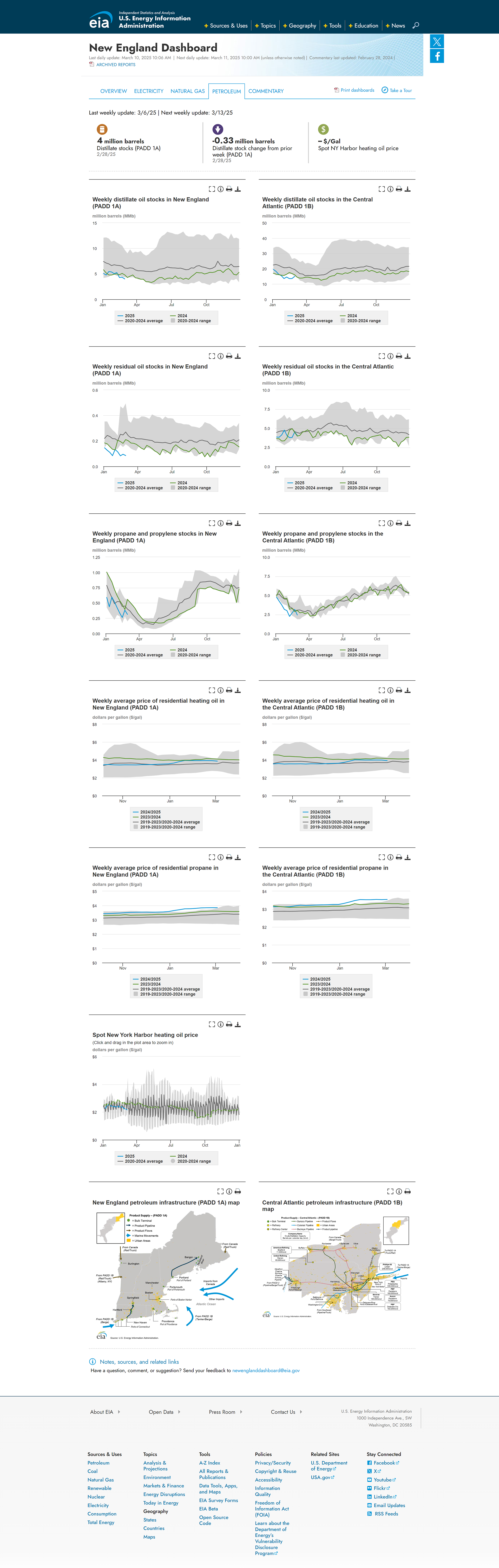
The petroleum view, including key metrics at the top.
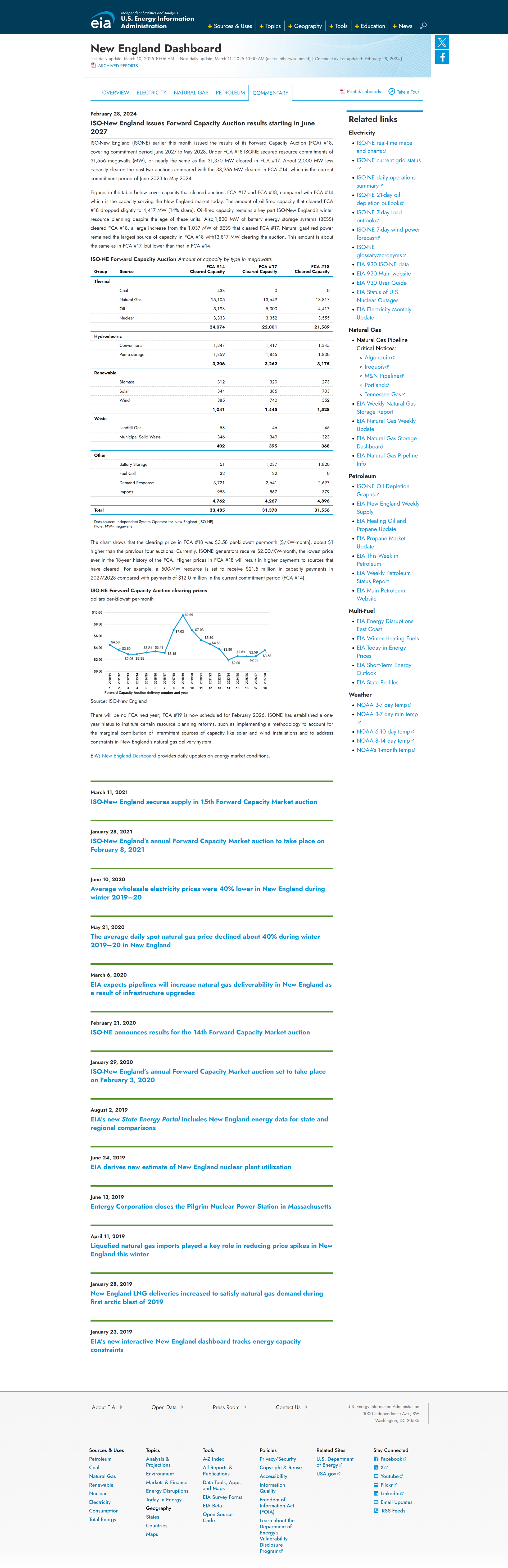
The commentary page, featuring an accordion format which allows the current commentary to be front and center while allowing users to see historical entries if desired.
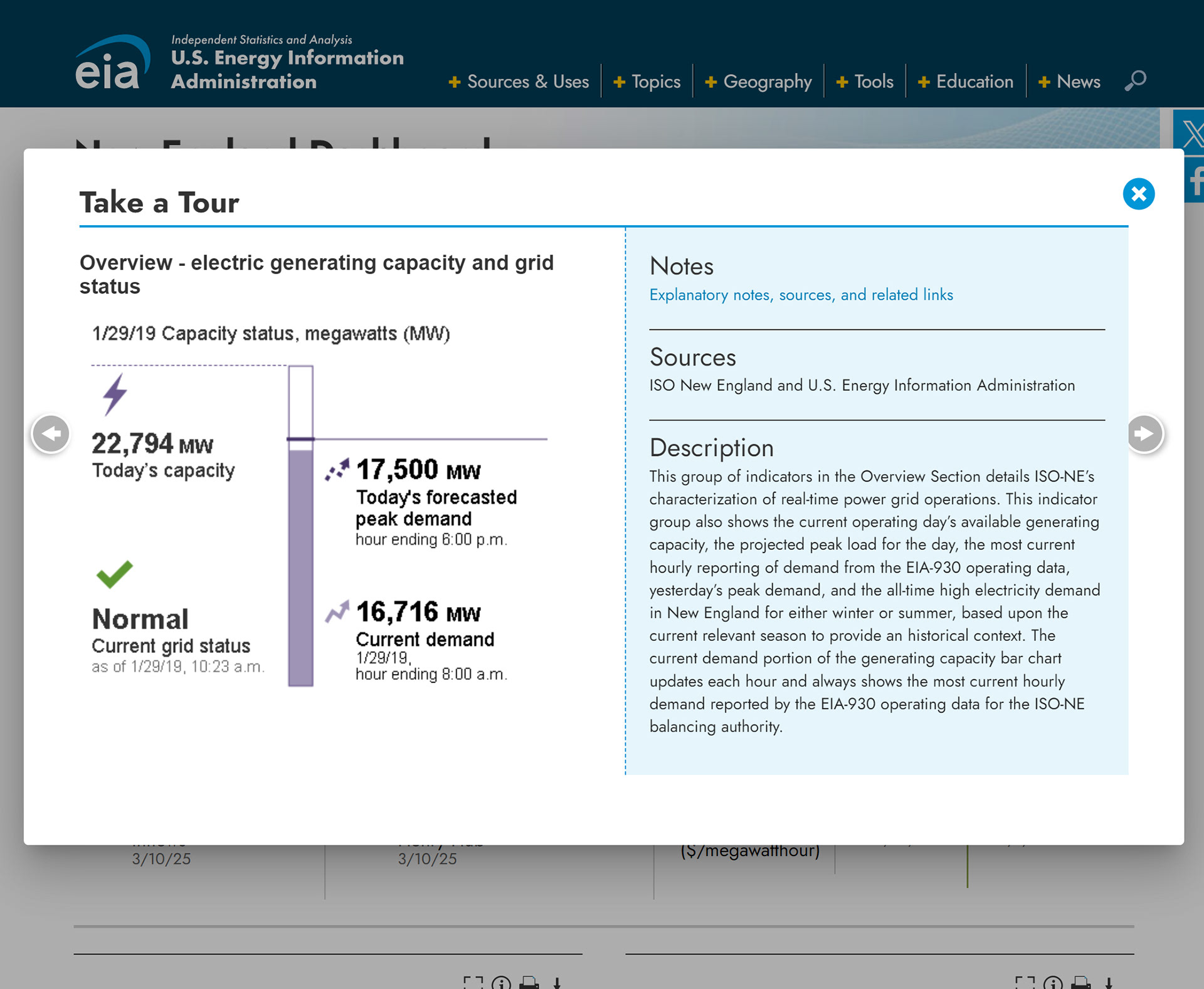
The "take a tour" feature, which provides descriptions, notes, and sources for the various visualizations, and allows subject matter experts to give additional context where appropriate.


