• Make the experience fully responsive and mobile-friendly
• Replace dynamic query string architecture with SEO-optimized pages
• Introduce interactive charts, dynamic infographics, and a maintainable codebase
• Empower non-technical staff to update content without introducing errors
• 16% increase in visits and 5% lift in page views post-launch
• 89% user satisfaction with design and navigation
• Platform now supports 169+ articles and 100+ visualizations across desktop, mobile, and tablet

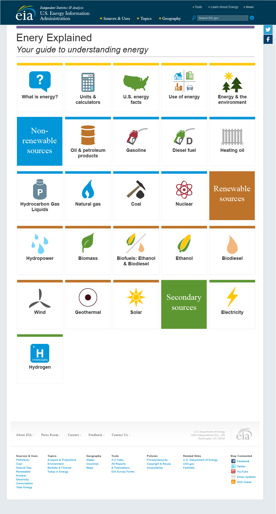
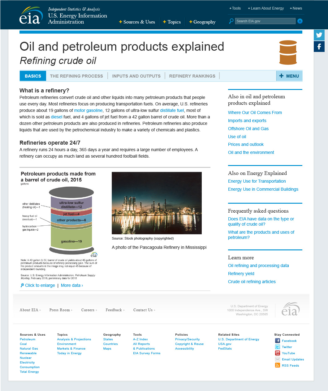
Original Energy Explained design circa 2016.


I created a menu containing all the different Energy Explained sections. I added icons for visual appeal, and set up a grid which would yield large tap areas on mobile and tablet. I knew I would need to add in the sub-navigation for each section and decided to wait on designing it until after we decided on a menu design.
• Option 3 has more defined subsections for the types of energy sources and offers navigation to EIA's state and international energy pages.
Menu option 1
Menu option 2
Menu option 3
Menu option 4
• Images and visualizations would be in the right-side column.
• Sub-navigation at the bottom (e.g., navigation within Diesel fuel explained or Hydropower explained).
• Related information at the bottom.
• With the images and visualizations in the side column, it would allow us to continue using the image files we already had on the old site, and staff maintaining the pages wouldn't have to consider where to place them relative to the written content.
• On longer/shorter pages with more/fewer images, this could lead to awkward column lengths and white space (e.g., long side columns with lots of white space in the main column).
• On mobile, all the images and visualizations would end up under the text content and be completely out of context.
Diesel fuel explained, option 1
Hydropower explained, option 1
• Images and visualizations would be inline with the content.
• Images and visualizations could span the whole column if desired.
• Sub-navigation on the right (e.g., navigation within Diesel fuel explained or Hydropower explained).
• Related information on the right.
• With the images inline with the content, there'd be fewer instances of overly long right-side columns (this occurs on other parts of the EIA website).
• On desktop and mobile, images and visualizations would show within the context of the text they're supporting.
• We may have to pick some new images when the originals aren't big enough to fit the new space. This will add a little to overall project time.
Diesel fuel explained, option 2
Hydropower explained, option 2
Oil and petroleum productions explained, option 2. This mockup shows a page with more tabs along the top so stakeholders could see how I planned to integrate them on the pages with multiple tabs. The tabs could be applied to option 1 or 2 as the top, page-level navigation is the same in both designs.
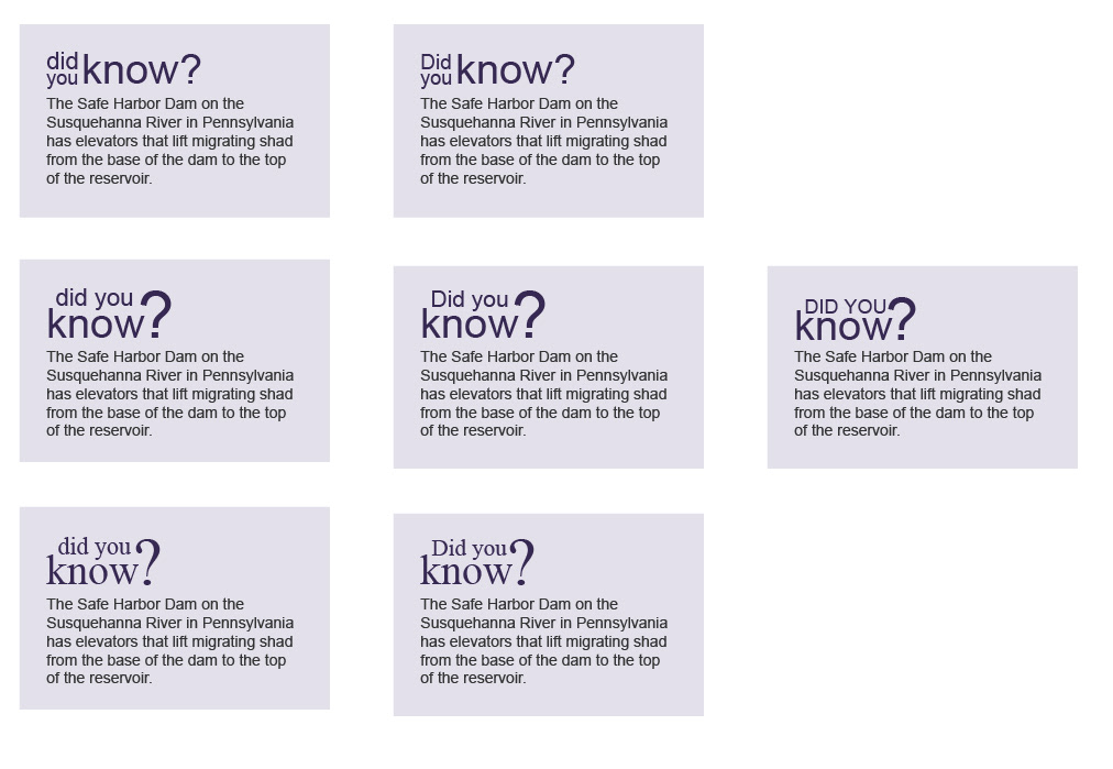
Options for styling the Did You Know callouts.
• I knew I would be the person implementing the CSS
• The EIA website already has a design system in place so most of the layout changes between desktop, tablet, and mobile would be taken care of.
• I would be the final reviewer for mobile and tablet styles.

• Setting up every page within Energy Explained with URLs, page titles, descriptions, and keywords to maximize SEO
• Asking the content owners to provide me with descriptions and keywords for all the pages
• Asking the content owners for feedback on a list of page titles and URLs
• Creating the custom SVGs in Illustrator and exporting the code
• Integrating the SVG code with PHP to make it dynamic
• Writing the local CSS
• Migrating all the text and images from the existing site to the new pages
• Reviewing, reviewing, reviewing

Custom and dynamic SVG bar chart. The labels and bars all adjust automatically when the content owners update the data.
Custom and dynamic SVG expanded pie chart. The labels, pie slices, and bars all adjust automatically when the content owners update the data.
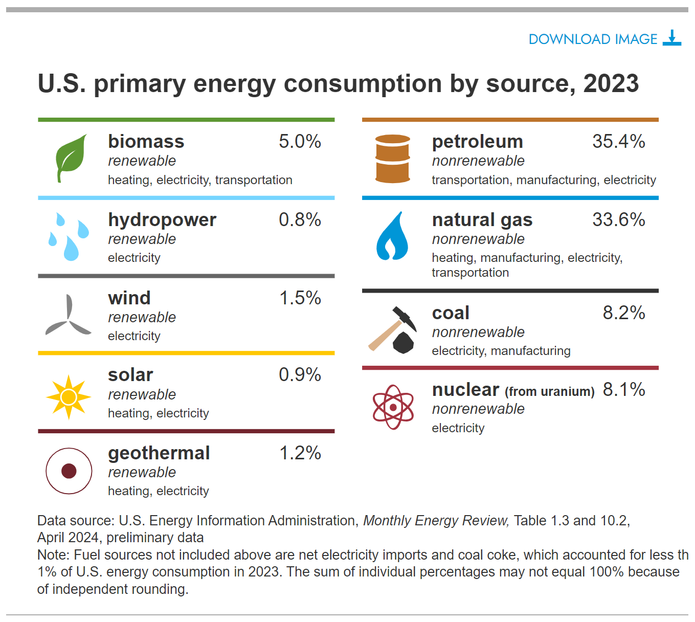
An infographic I created in HTML that users can download as an image using the same download feature as the custom SVGs.
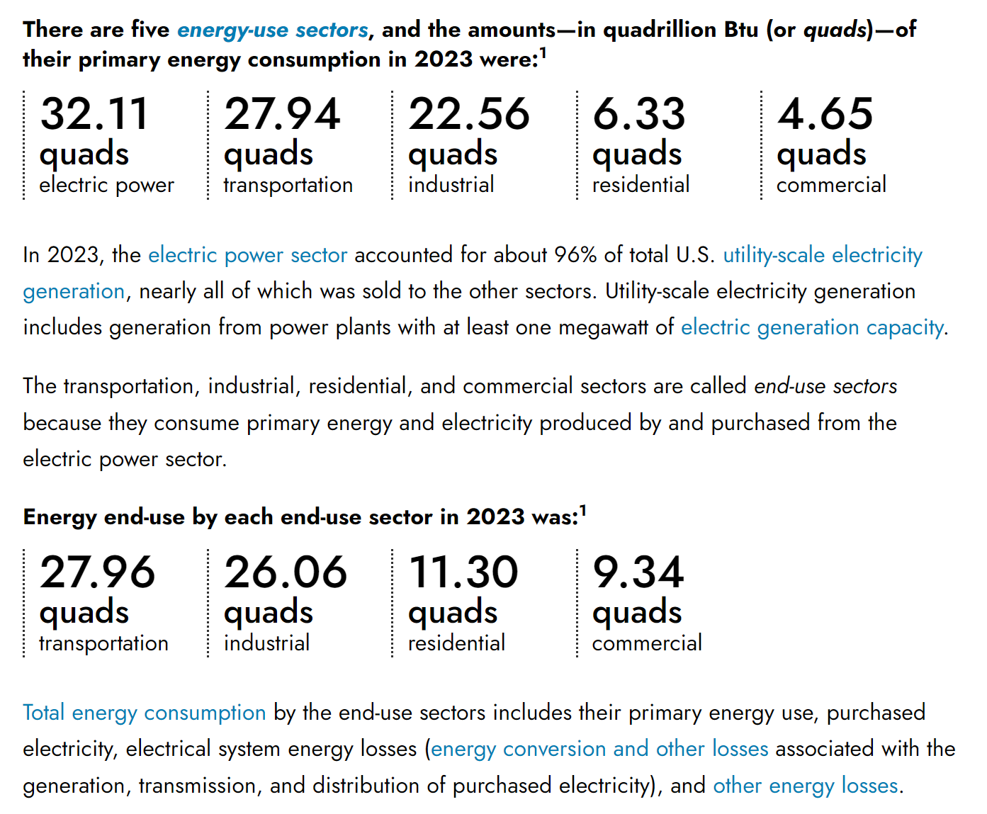
The previous Energy Explained had lots of bullets with numbers that were...boring. I styled them with some CSS to make them more like infographics so they're more engaging and more scannable.
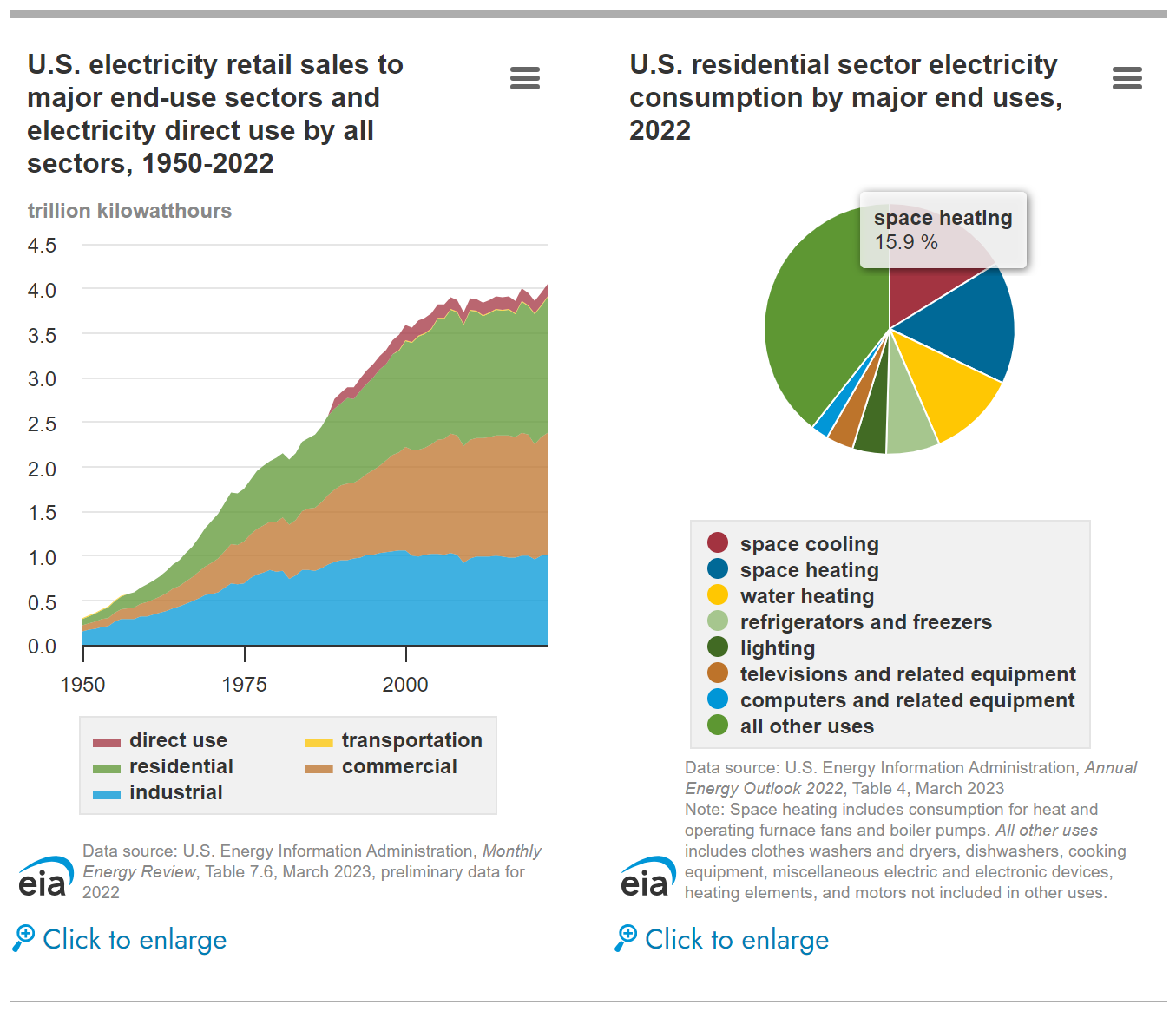
Interactive HighCharts that have tooltips for data points. Users can click the link to enlarge them. If we didn't (nearly always) have such long chart titles, I would have added a zoom button next to the chart menu, which might be more noticeable.
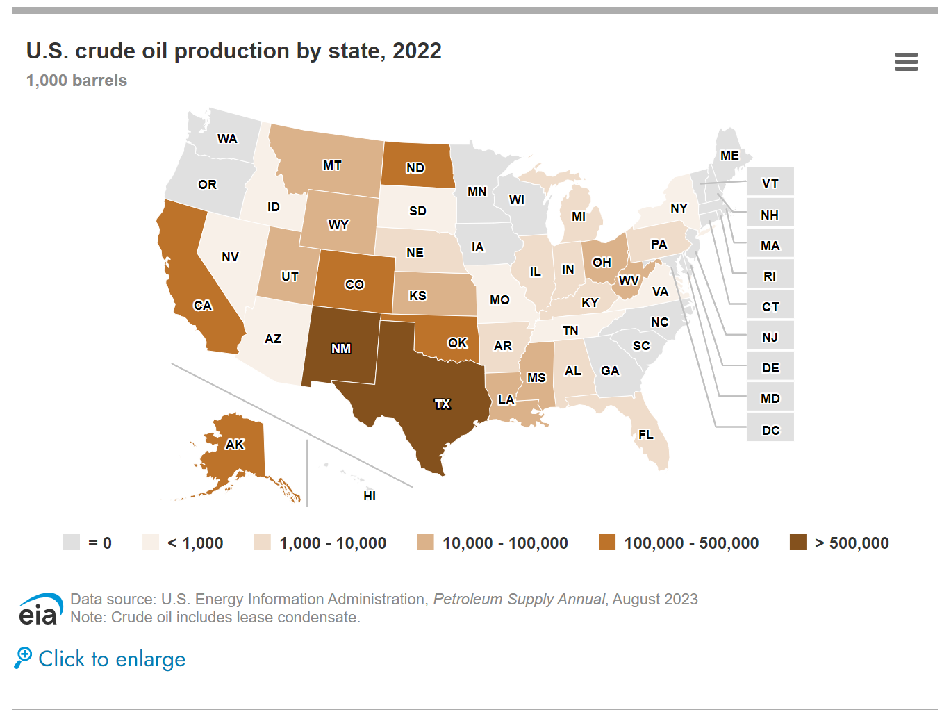
Interactive maps (also HighCharts) that have tooltips for data points. Users can click the link to enlarge them. For consistency, the enlarge link is in the same place as on all the other enlargeable charts and images.
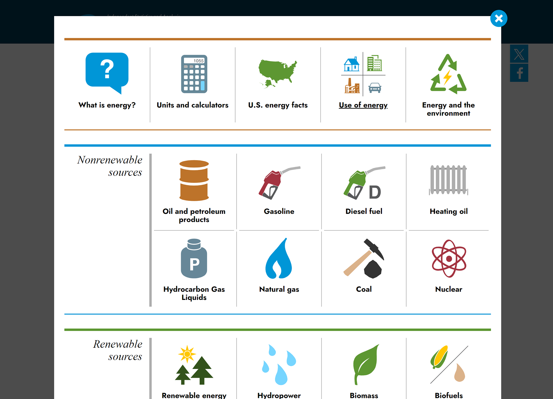
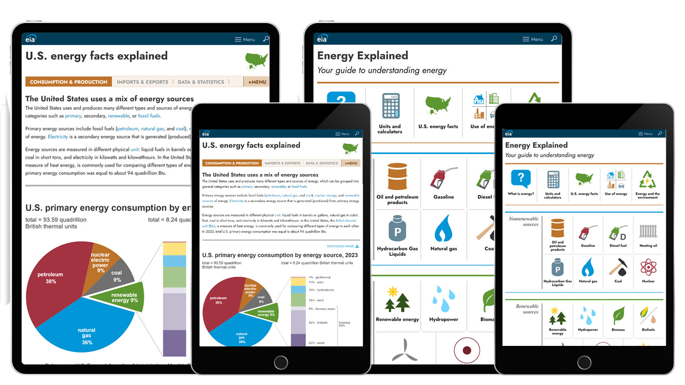
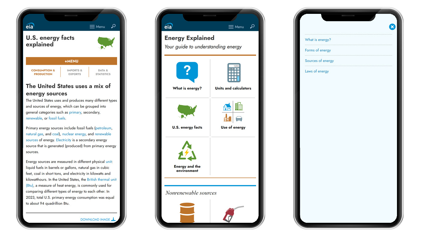
Clicking the menu button on the page displays an overlay with the Energy Explained menu, which is also the Energy Explained homepage.
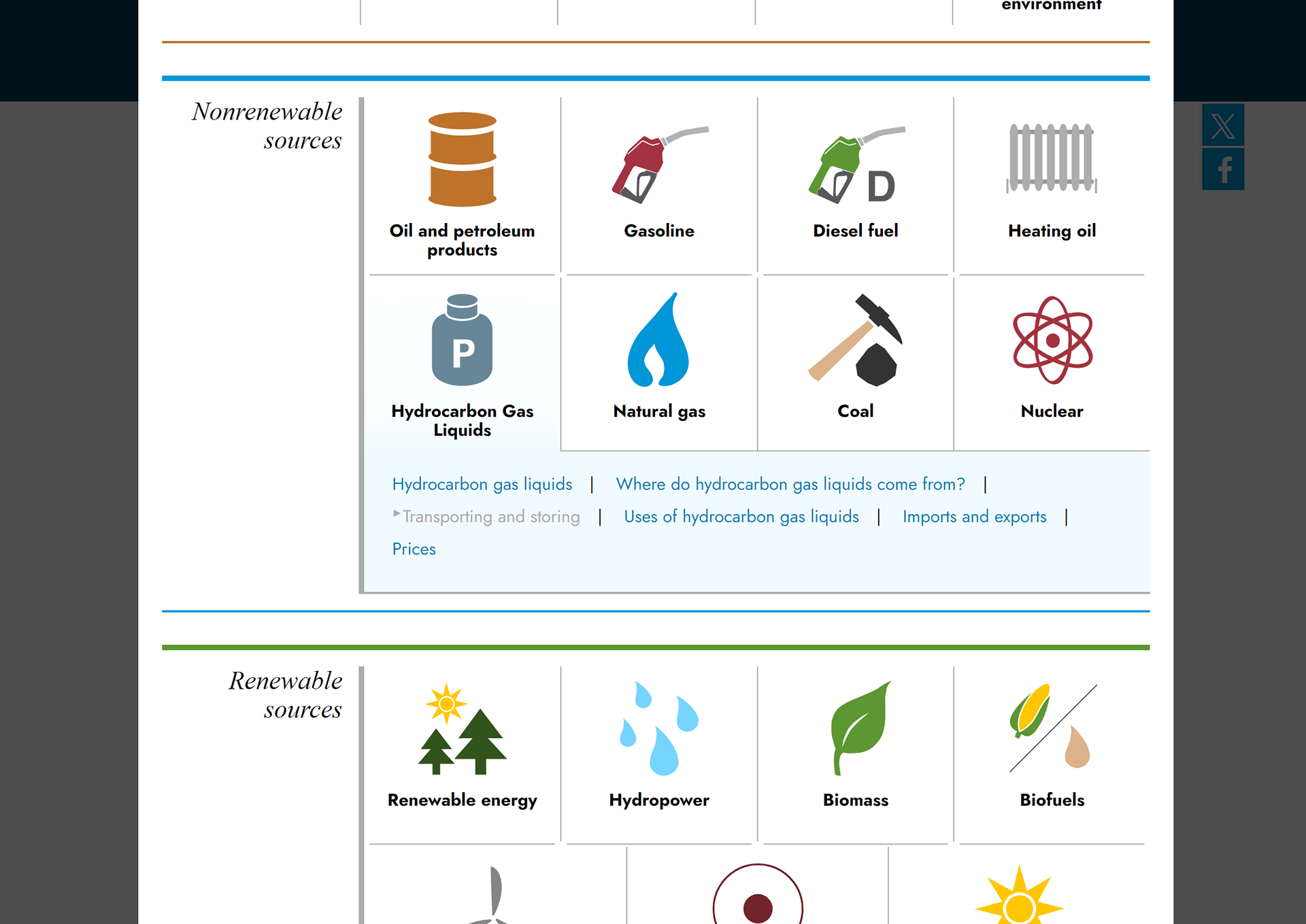
Clicking one of the icons opens a sub menu with links to the pages within the section.