Client
U.S. Energy Information Administration (EIA) – the federal agency responsible for energy data transparency
Context
The U.S. electric grid lacked a public-facing tool to monitor real-time demand and generation across regions. EIA sought to change that by launching its first near-real-time dashboard, enabling greater visibility into grid operations and strengthening public trust in energy data.
Objectives
• Design an intuitive, responsive platform for hourly grid data
• Visualize real-time electricity demand, generation, and regional flows
• Redesign the tool to align with modern UX standards, accessibility, and user feedback
• Support data-driven decision-making for analysts, policymakers, and the public
• Visualize real-time electricity demand, generation, and regional flows
• Redesign the tool to align with modern UX standards, accessibility, and user feedback
• Support data-driven decision-making for analysts, policymakers, and the public
Strategic Value
This tool established EIA’s capability in real-time energy analytics and laid the groundwork for future platforms like the Wholesale Electricity Market Portal. The redesign introduced modular dashboards, improved data context, and accessibility upgrades—expanding the tool’s usability across a diverse audience.
Results
• 1.2M+ views from 244K active users annually
• Winner of the 2017 GCN dig IT Award in Data Analytics & Visualization
• Praised by analysts and forecasters as “very helpful,” “excellent,” and “spectacular”
• Established a new benchmark for near-real-time public data tools at EIA
• Winner of the 2017 GCN dig IT Award in Data Analytics & Visualization
• Praised by analysts and forecasters as “very helpful,” “excellent,” and “spectacular”
• Established a new benchmark for near-real-time public data tools at EIA

Objectives for version 1 (before the redesign)
• Real-Time data accessibility. Ensure users can access up-to-date hourly, daily, and weekly electricity data to monitor supply, demand, and system flows effectively. (This is the first hourly data collection conducted by a federal statistical agency!)
• Comprehensive coverage. Provide data for all 66 electric system balancing authorities in the contiguous United States, offering both national and regional insights.
• Interactive visualizations. Implement intuitive analysis tools and visualizations that allow users to explore hourly, daily, and weekly electricity patterns.
• Inter-system flow representation. Clearly depict electricity flows between different electric systems to enhance understanding of interconnections.
• Data downloads. Allow users to download the data they want.
• Provide trade data. Enable users to see the flows of electricity with Canada and Mexico.
Ideation
I met with data analysts and stakeholders to discuss the requirements and to learn about the data they wanted to publish. They provided some charts and initial concepts (below) to explain their ideas. After several productive discussions, I started working on mockups.
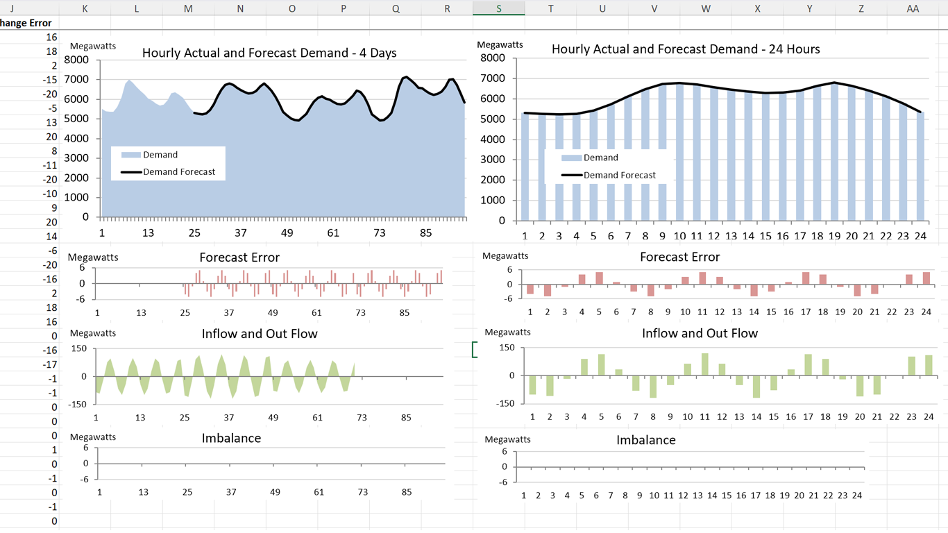
Demand balance charts
Interchange charts
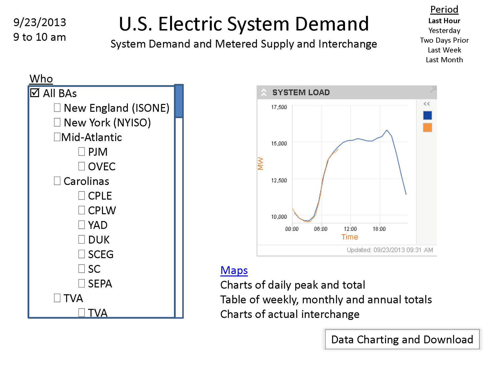
Initial concept screen from stakeholders showing U.S. demand
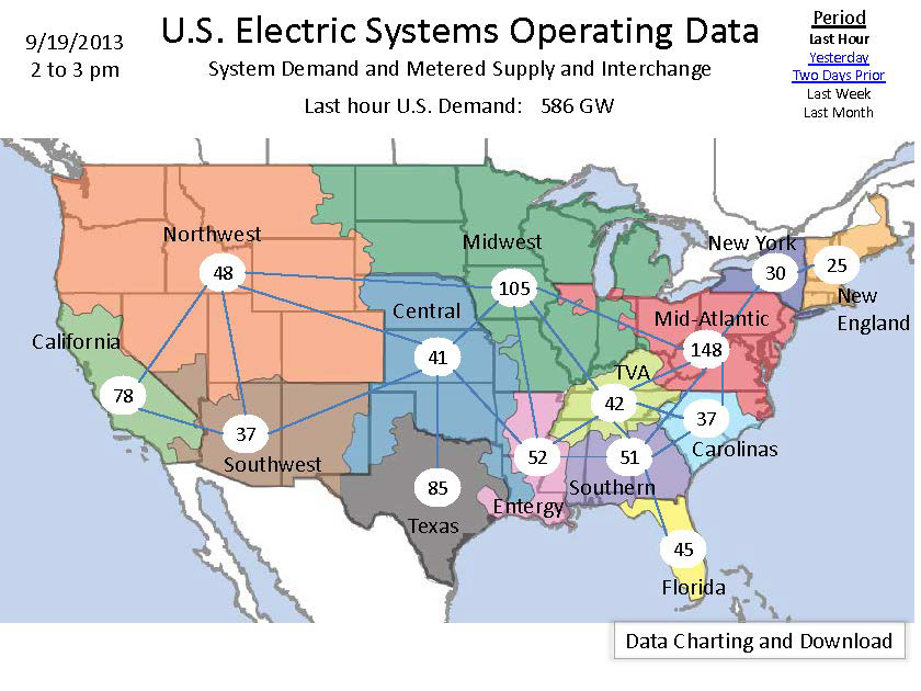
Initial concept screen from stakeholders showing last hour demand data
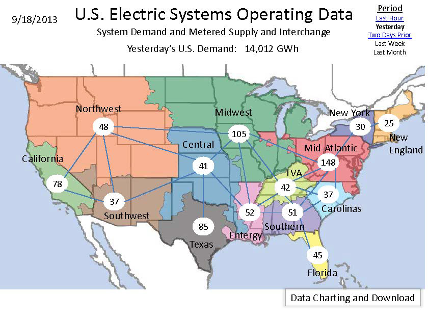
Initial concept screen from stakeholders showing yesterday's demand data
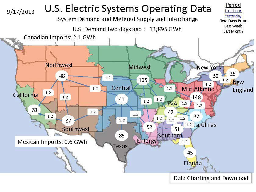
Initial concept screen from stakeholders showing interchange data
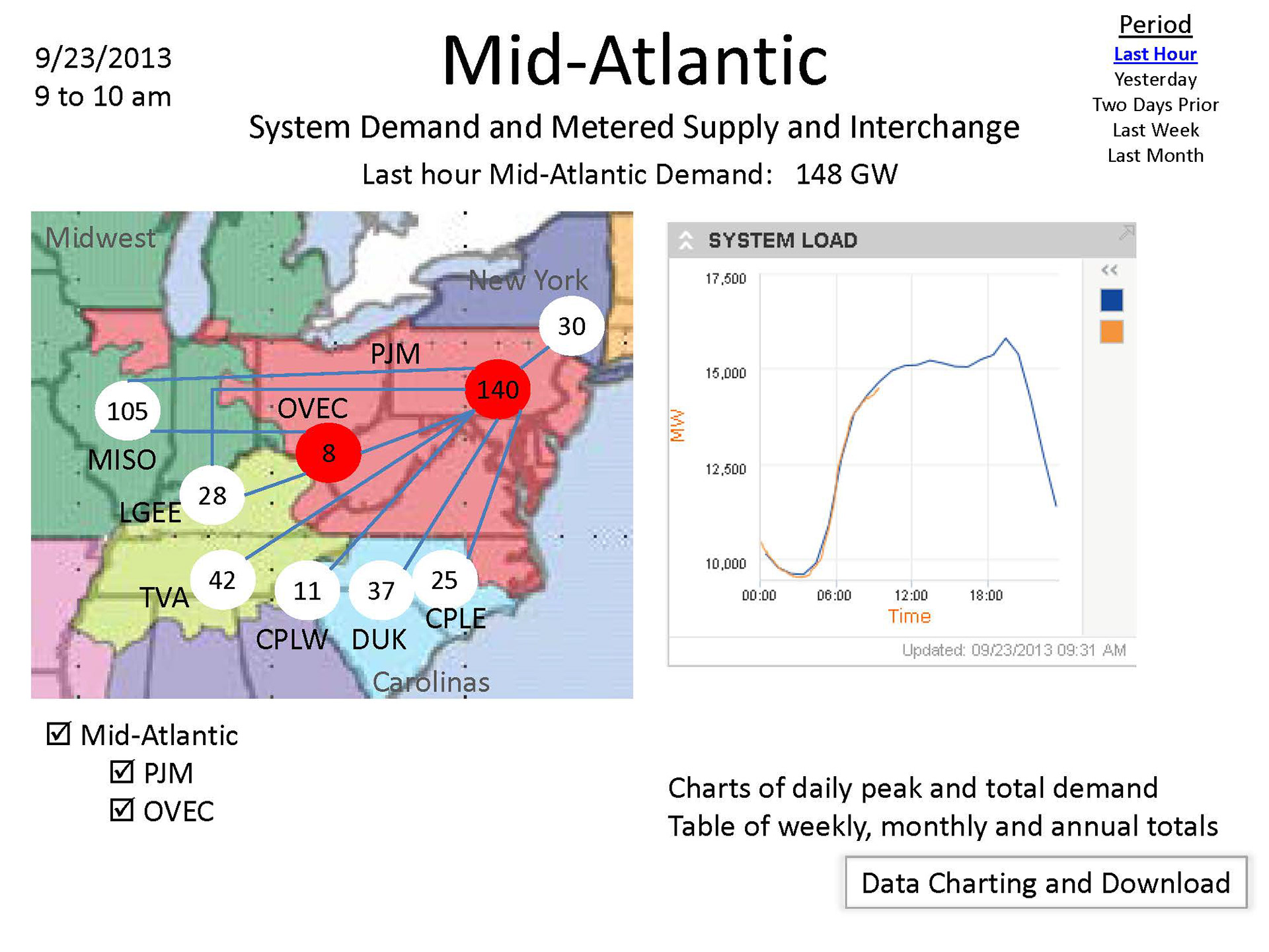
Initial concept screen from stakeholders showing regional demand data
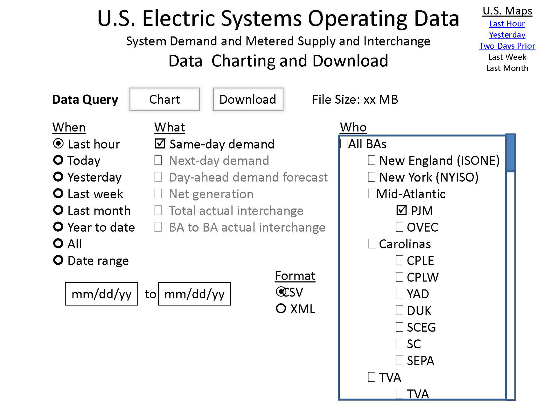
Initial concept screen from stakeholders showing charting and downloading

Annotated wireframes

Iterating some more
After the product was on our beta page for some time and we'd collected enough feedback, I met with stakeholders to discuss improvements. We decided to make some changes to the overall information architecture and the UX.
• Split the content into multiple tabs so the grid status map would be on one tab, graph and table data in another, and an executive summary in a third.
• Add a balancing authority and region selection menu that's separate from the grid status map. This was particularly important since we opted to move the graphs and tables to a separate tab from the status map.
• Add a select data menu to allow users to customize the data in the tables.
• Add an "Order by" toggle that would change the hierarchy in the first column of the table and essentially pivot the data.
• Simplify the date/time selector for the grid status map by creating an hour slider on the map.
• Add a note under the grid status map to help users understand the data and its availability.
• Add a ticker with the most relevant data for users.
• Add an executive summary to provide aggregate data and more of a high-level overview.
Since this was an iteration on a live product, the project manager and the developers needed mockups that showed the modified content but also highlighted the differences. I updated the original mockups and highlighted regions that were new or different and added annotations where necessary.

Executive summary section

Redesign objectives (i.e., version 2.0)
• Convey the immediacy of the data (e.g., that demand is available within 1-2 hours).
• Provide meaningful context for the demand data.
• Visualize the various, regular patterns that exist by time (there are distinct daily, weekly, and month/seasonal patterns) and geography (patterns vary by region/climate) in electricity demand.
• Provide a comprehensive, in-depth view of a single balancing authority or region.
• Add new generation by energy source data while clearly explaining what may or may not be included in this.
• Show the overall magnitude and patterns of interchange flows between BAs/regions.
• Add meaningful context to data for trade to/from Canada and Mexico.
• Provide a complete picture of what data elements are available in this product.
• Make csv/xlsx data files and data documentation more obvious and accessible.
• Present an integrated data view that also accommodates the lags in data availability.
Design decisions
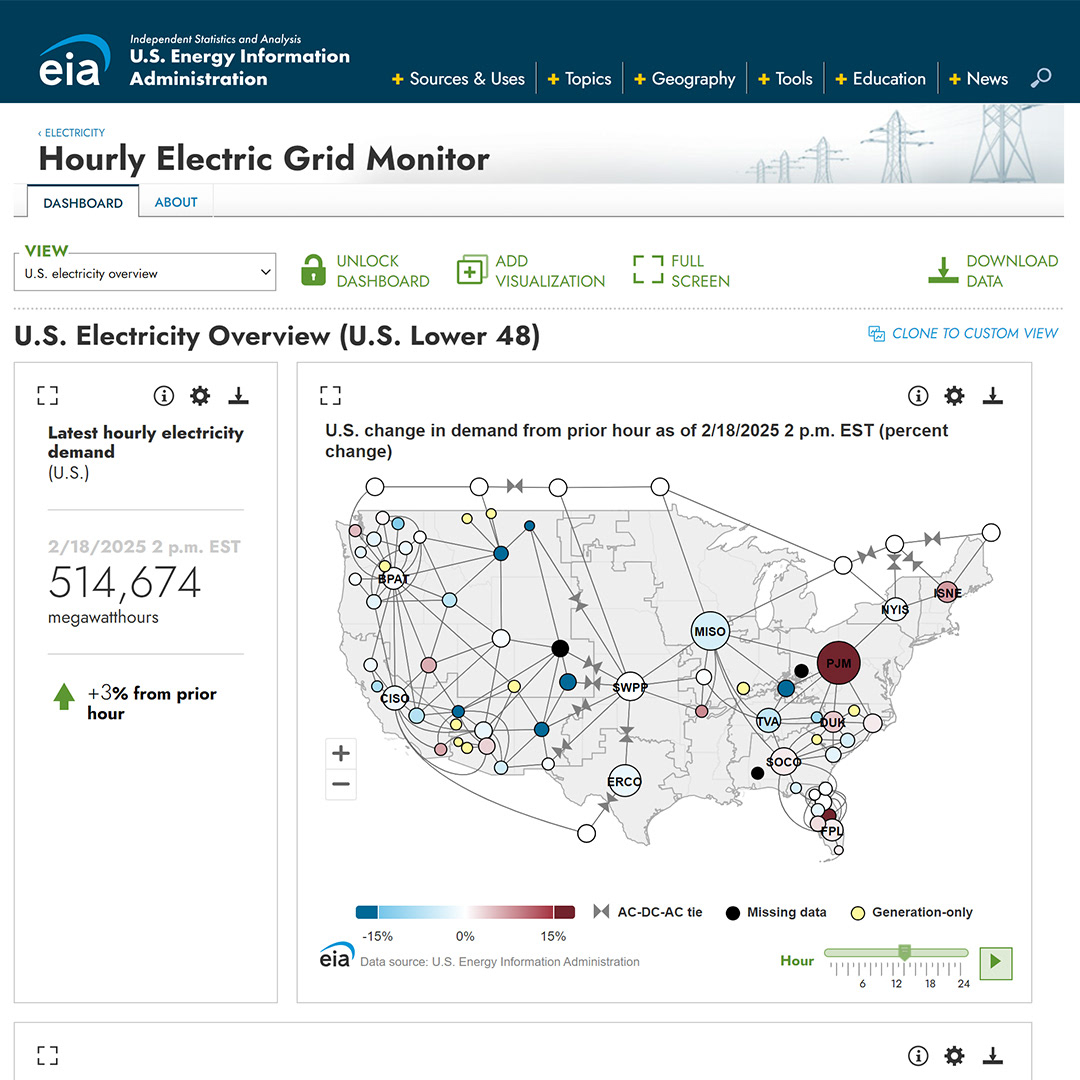
The original version of this tool was one of EIA’s most ambitious visualizations—but over time, it became clear that the experience wasn’t keeping up with how people actually needed to use the data. Navigation was disjointed, the interface emphasized structural hierarchy over insight, and some of the visuals risked misinterpretation due to data context issues.
By the time we started this redesign, I’d already led the creation of several modular dashboards and the State Energy Portal, and those experiences made the next step obvious: the Hourly Electric Grid Monitor needed to be reimagined as a dashboard.
A dashboard structure allowed us to group relevant metrics together and introduce custom views—enabling users to focus on what mattered to them, whether that was a national overview or a deep dive into a single balancing authority. We also used this shift to address longstanding usability gaps. For example, demand vs. forecast comparisons are only meaningful in some regions due to definitional inconsistencies. So we removed them from the map and re-centered them in line charts, where we could offer better context.
The new structure also gave us room to explain data caveats more clearly—like the limitations of reported generation mix data—and allowed us to preserve relationships across levels of granularity (e.g., sub-regions vs. their parent BA). We improved access to data files and documentation, emphasized analytical density over visual sprawl, and structured the layout to support quick comparisons and efficient analysis across multiple views.
From the start, the redesign was built for growth. We created a modular system that could accommodate additional metrics, new data types, or even entire new views over time. That flexibility, paired with a more thoughtful UX, laid the foundation for a tool that could evolve alongside user needs—not just display the data, but actually support meaningful analysis.

Mid-fidelity interactive wireframes

Developer Collaboration
In addition to leading the UX design, I contributed directly to the front-end implementation of both the original dashboard and its full redesign. I wrote all of the CSS and worked within the Angular codebase, committing layout and styling updates in a Git branch. I diagnosed and resolved structural issues—such as redundant wrapper elements that broke CSS inheritance—by replacing them with Angular’s ng-container. I also implemented conditional logic within Angular templates to apply dynamic classes based on component state, enabling precise styling for interactive elements and edge cases. This hands-on approach ensured the visual system functioned as designed across screen sizes and states, while reducing friction during implementation and review cycles.
Design System Thinking
Because the Hourly Electric Grid Monitor needed to align with EIA’s broader design language, I prioritized consistency in components, typography, and interaction patterns. I extended existing styles to support complex visualizations while maintaining a unified user experience across tools. This included designing reusable chart containers, consistent tab treatments, and scalable UI patterns that later informed updates to related dashboards. My decisions balanced immediate clarity with long-term maintainability across the product ecosystem.
Accessibility Enhancements
Accessibility was a core priority throughout the redesign. I structured content and styling to support screen reader compatibility, keyboard navigation, and color contrast compliance. I also pushed for upgrading Highcharts, as the older version lacked the accessibility module and offered limited chart responsiveness. The upgrade, implemented in early 2025, enabled better support for users with assistive technologies and improved the adaptability of visualizations across devices. While additional refinements are now unlikely due to agency-wide reductions in force and a freeze on major web updates, the improvements I championed laid the groundwork for a more accessible and future-ready product.
Note on Current Implementation
After I completed the redesign and front-end implementation, the development team upgraded Angular and Highcharts in early 2025. These upgrades introduced some new CSS issues, primarily affecting the mobile layout, due to changes in component structure and rendering behavior. I’ve identified several areas that would benefit from refinement, but a freeze on major web updates—prompted by government downsizing and staffing reductions—has paused further work. Despite these limitations, the underlying design and architecture remain sound, and the tool continues to deliver near-real-time insights to the public.

Impact
The redesigned Hourly Electric Grid Monitor received over 1.2 million views from 244,000 active users annually, making it one of EIA’s most accessed public-facing tools and its first near-real-time product—paving the way for later tools like the Wholesale Electricity Market Portal. Users praised the monitor as “an excellent picture of our grid” and “very helpful in explaining energy use,” with additional requests for greater data granularity and integrated fuel-mix details—underscoring its value to analysts, forecasters, and policymakers. The original launch earned the 2017 GCN dig IT Award in Data Analytics and Visualization, marking EIA’s first-ever win in the award’s 29-year history and surpassing finalists from FEMA, HHS, and the U.S. Army.