Client
U.S. Energy Information Administration – the federal agency responsible for national energy data and analysis
Context
After 10+ years without a visual or structural update, the EIA.gov homepage was outdated, difficult to navigate, and failed to reflect the agency’s evolving digital ecosystem. Users had trouble finding key data and analysis products, and internal stakeholders needed a better way to highlight critical content.
Objectives
• Replace the outdated design with a modern, responsive layout
• Elevate priority content like Today in Energy and Data Highlights
• Remove the carousel to reduce confusion and maintenance overhead
• Surface tools, apps, and maps previously buried deep in navigation
• Align branding and structure with the agency’s broader site updates
• Elevate priority content like Today in Energy and Data Highlights
• Remove the carousel to reduce confusion and maintenance overhead
• Surface tools, apps, and maps previously buried deep in navigation
• Align branding and structure with the agency’s broader site updates
Strategic Value
I led UX, design, and partial implementation for this high-visibility redesign, coordinating closely with stakeholders and a front-end developer to ensure execution matched the mockups. The result was a clean, user-centered homepage that improves discoverability, elevates core content, and establishes a stronger entry point to the agency’s energy ecosystem.
Results
• 2.25M+ views from 1M+ users in its first year
• Streamlined layout and clearer content hierarchy
• Increased visibility for daily analysis and high-demand data tools
• Stakeholder-aligned, future-ready foundation for continued content growth
• Streamlined layout and clearer content hierarchy
• Increased visibility for daily analysis and high-demand data tools
• Stakeholder-aligned, future-ready foundation for continued content growth

Objectives
• Make the homepage look current and in line with branding on other, newer sections of the website
• Remove the carousel. It involves too much maintenance and causes confusion for users. Some features stayed in the carousel for a long time and when we removed them, some users didn't know where to find them anymore.
• Add additional, permanent navigation into some of the major sections of the website so returning users can retrace their paths.
• Increase the space available for Today in Energy. As EIA's only daily analysis that covers current issues about energy, it should be one of the most prominent items on the homepage. It's also one of the main reasons visitors come to the EIA homepage.
• Increase the visibility of the data highlights section. One of the primary reasons why users visit EIA.gov is to find energy data and the homepage should make it easy to see the newest, most relevant data EIA has to offer.
• Showcase EIA's interactive content. Over the years, EIA has produced numerous interactive tools, apps, and maps and they should be highlighted on the homepage so they're easier for users to find.
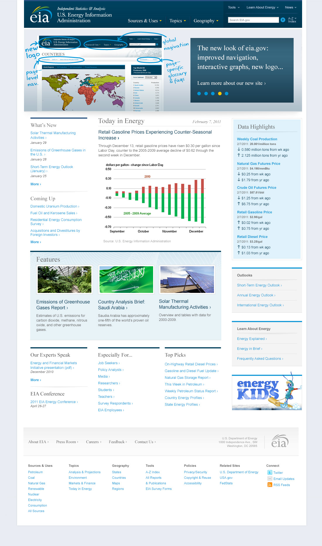
Old EIA.gov homepage

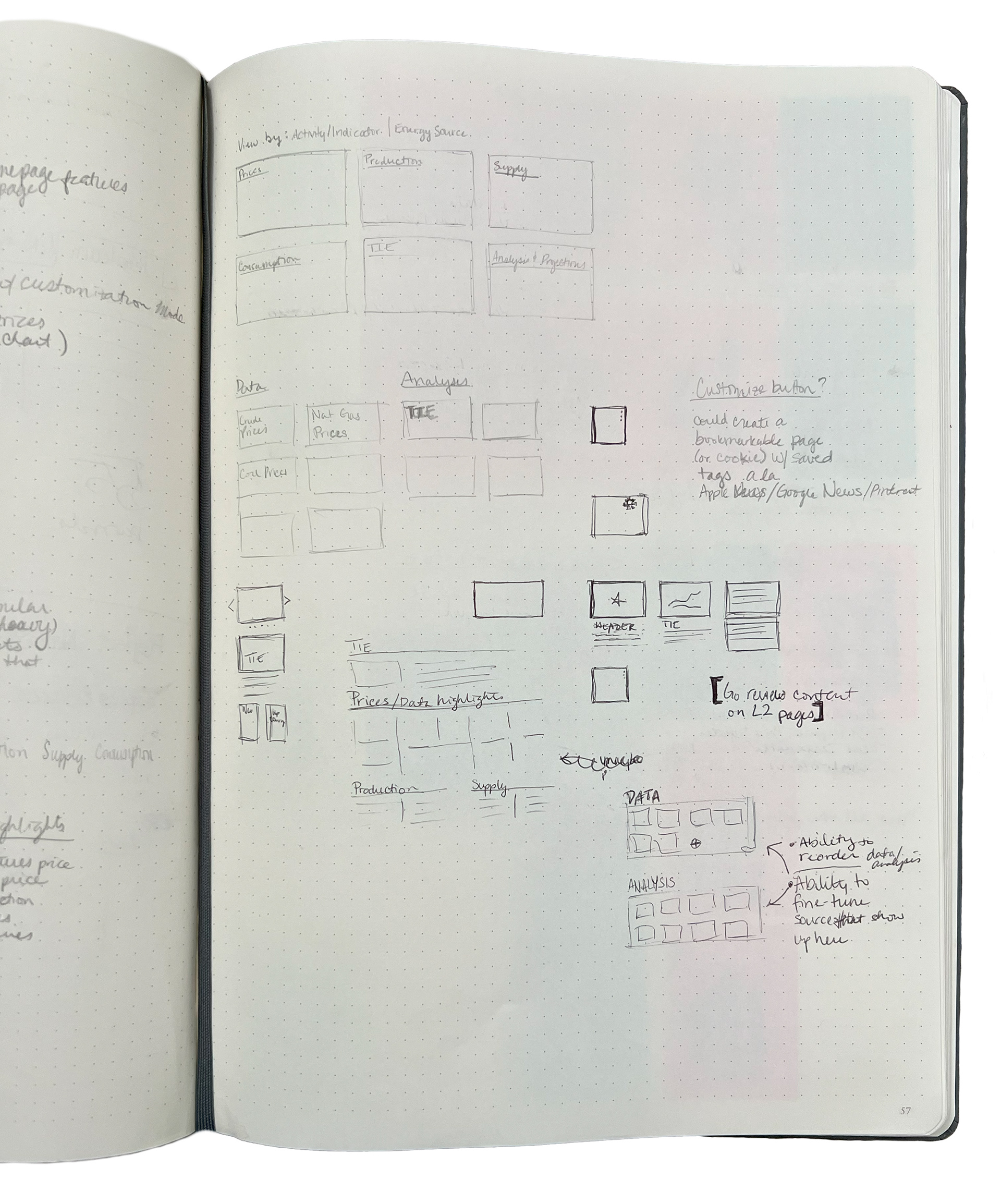
Ideation and sketching
A few years before I officially started redesigning the homepage, I was asked to evaluate suggestions in a report from an outside contractor. After reviewing all the suggestions and considering user and business needs, I sketched out a few ideas for aspirational (for EIA) features.

Early mid-fidelity interactive wireframe
With these sketches in mind, I created a mid-fidelity interactive wireframe with some of the features I'd come up with.
Curated, plain-language search. One suggestion from the report was to have a large search box as the main way for users to engage with the website. Since some of EIA's key datasets are not tagged and therefore don't show up in search engine results, users sometimes fail to find what they're looking for. A curated search, however, might be better as it would allow EIA to offer content suggestions based on keywords from analytics and customer contact center reports. The suggestions also could include untagged datasets where appropriate. I designed this curated search with a plain-language prompt, "I'm looking for [select a topic] of [select an energy source]" to invite users to try it out.
Smaller carousel. When I made this initial mockup, I did not have stakeholder buy-in to remove the carousel completely, so I only reduced its size. Later when presenting the mockup, I suggested that we could remove the carousel completely and move the Today in Energy section to the top of the page.
Larger Today in Energy section. The Today in Energy section always includes an image and a paragraph of text. In the outdated homepage design, the available vertical space had a hard limit. This new design can expand as needed to accommodate a taller image and more text.
Customizable, visually engaging data highlights. I moved the data highlights into the middle of the page and made each data segment into a card. Each card has a menu that allows a user to remove it, resize it, go to the source data, or get the API key. There's also a + button at the end of the highlights to allow a user to add more data.
New, customizable analysis and projections highlights. I added a new section to highlight the analysis that EIA releases. Each card has a menu that allows a user to remove it, resize it, and go to the report (report titles would also link to the report). There's a card to search reports by tag (an existing feature on the reports and publications page) and a link to the reports and publications page. There's also a + button at the end of the highlights to allow a user to add more analysis/projections.
New data tools, apps, and maps section. I added this section to surface some of the interactive tools, apps, and maps that EIA has available, and provided a link to an existing page that lists all the tools, apps, and maps.
More engaging energy education section. Energy Kids was prominent on the outdated homepage but Energy Explained and the Frequently Asked Questions were less noticeable. I grouped the links into a new section and added icons to draw attention and to balance the visual weight of the Energy Kids image.
The wireframe below is an embedded, interactive Adobe XD file. Only the curated search and the three-dot menus in the first cards of the Data Highlights and Analysis & Projections Highlights are clickable.

High fidelity mockup
After officially starting the homepage redesign, I used the mid-fidelity wireframe to facilitate a discussion with key agency stakeholders to come to consensus regarding homepage features.
• We decided to remove the carousel and move up the Today in Energy section.
• Although stakeholders were excited about the customizable features, we determined the agency didn't have enough time or resources to implement them. I removed the menus from the Data Highlights and the Analysis & Projections Highlights sections.
• I changed the customizable and dynamically generated Analysis & Projections Highlights section to be static navigation that reflects the major sections from the global navigation.

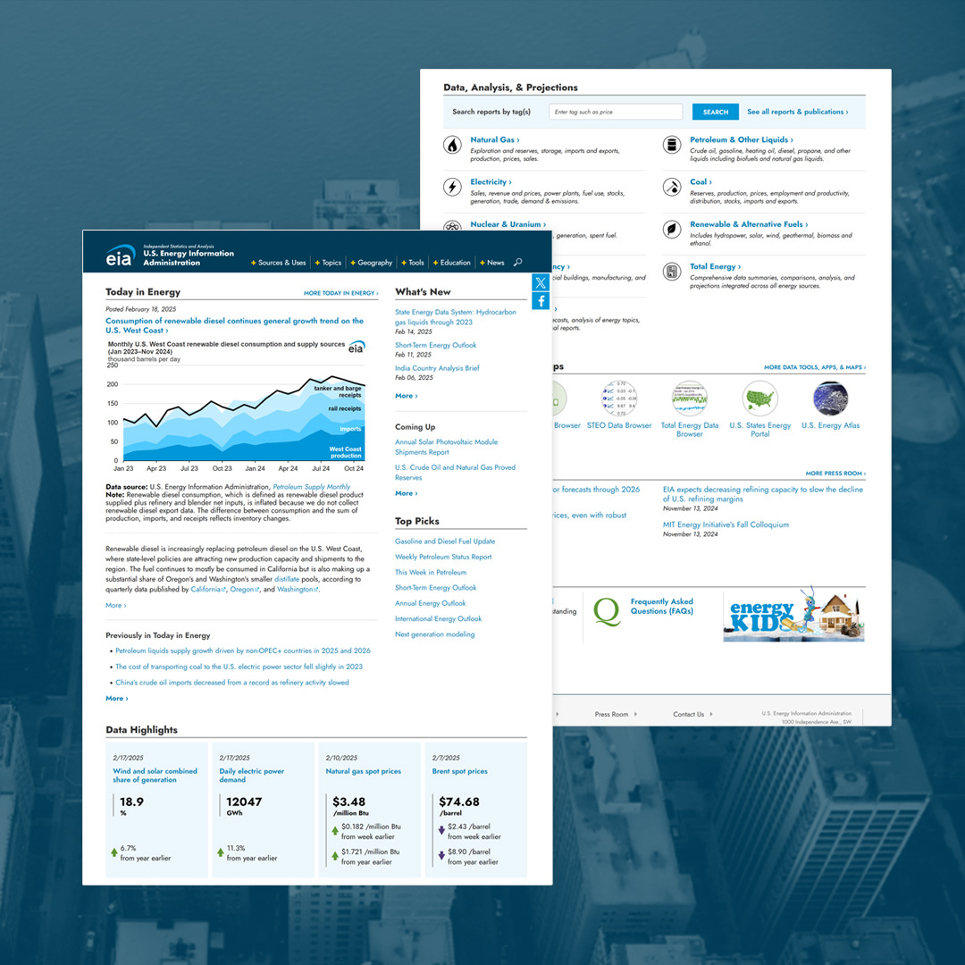
Final high-fidelity mockup
I met again with the stakeholder group to review the high fidelity mockup. We decided to iterate one more time.
• We added links to previous Today in Energy articles.
• We simplified the Data, Analysis, & Projections navigation section and moved some of the links into a Top Picks section.

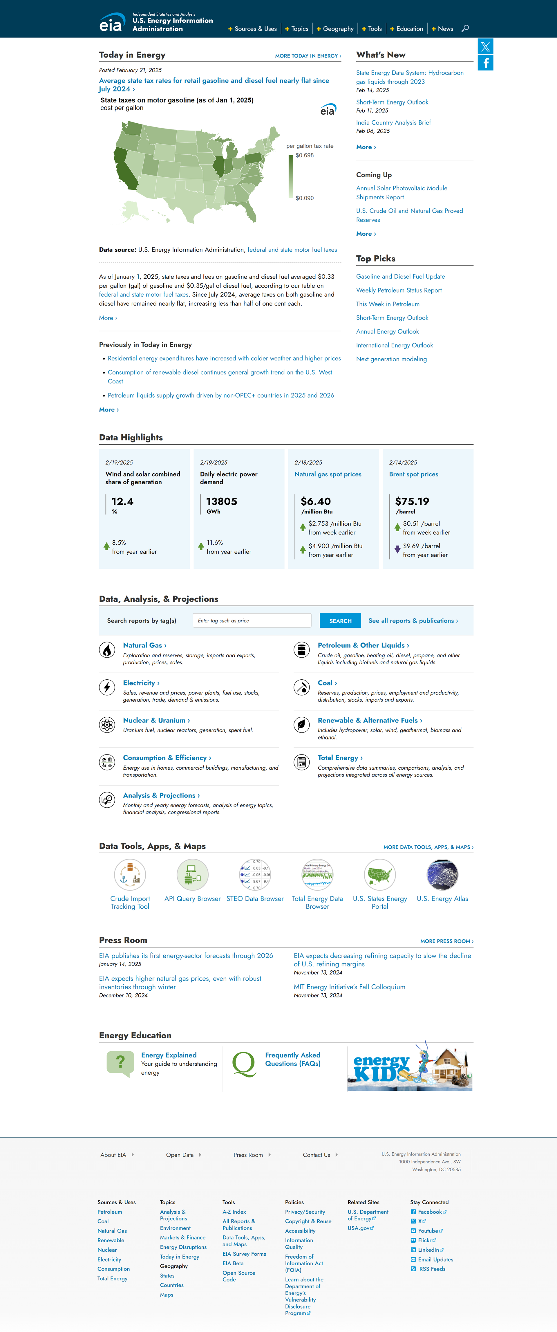
Redesigned EIA.gov homepage
After stakeholders signed off on the final mockup, I managed its implementation. The front-end developer coded most of the PHP, HTML, JavaScript, and CSS for the homepage. I provided feedback on CSS styles, so that they matched the mockup. I also wrote the PHP and HTML code that dynamically pulls in the Today in Energy article and links from the Today in Energy section of the EIA website.

Impact
The redesigned homepage launched in September 2024 and quickly became a more effective entry point to EIA’s extensive content. It brought visual clarity, modernized the agency’s public-facing identity, and prioritized the content users come for most—like Today in Energy and key data highlights. The redesign also surfaced tools, maps, and apps that had previously been buried, making them easier to discover without overloading the page. By rethinking the structure and presentation, we created a homepage that better reflects user needs while staying lightweight, accessible, and maintainable. In its first year, it received over 2.25 million views from more than 1 million users.
Below is a screenshot from the live site.